Headings on web pages and in SEO
On web pages, as in other documents, headings organize and structure the text.
The first heading (heading 1) is the title of the entire text.
Texts are usually subdivided into several sections, which can also be given headings. These are the subheadings: the heading 2s.
Often these sections are further subdivided into smaller sections. The headings of these subdivisions will be the heading 3s.
If a subdivision with heading 3 is also subdivided into further sub-sections, then their headings will be level 4 headings, i.e. heading 4s.
On the web, we use a heading structure of up to 6 levels.
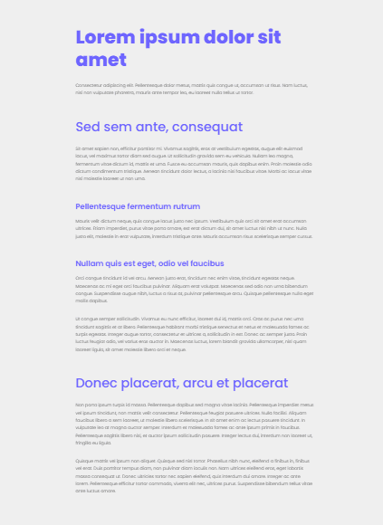
Formatting (styles) of headings
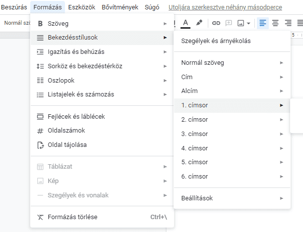
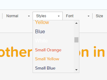
Since the most striking feature of headings is the way they are formatted, the heading levels are also found in the Styles options in text editors:

Heading 1 is usually at the top of the page, in the largest font, or visually highlighted in some other way (e.g. in a different colour, font, background image, background colour) to make the text more prominent and unique styled. Looking at a document, a web page, we can clearly and immediately identify which text element is the main heading of the page.
Additional headings are also visually distinct from the body text, but these are less visually prominent as you move down the level from heading 1, and there may be more of them.
The function of headings, or why you should pay attention to heading structure
Headline styles visually highlight headlines of the same level with consistent formatting.
In text editors, headings can be used to generate a table of contents, or to link to a section of text by jumping to the appropriate subheading by clicking on the link.
The primary function of headings is to help the reader understand the text and find their way around it. Even if you just scroll through a text and read only the (well-written) headings, you can still get an idea of what the text is about, which aspects of the topic defined by the H1 are addressed, from which point of view and to what depth.
Headings thus help readers to find what they want to know more quickly.
The page outline (table of contents) provided by the headings of a web page is also informative for machines.
For example, what the title of the text is and how the text is divided into subheadings is a useful sign of relevance for search robots, a useful clue for interpreting the content. Thus, headings that are inserted in the right place and written properly are another plus point for SEO.
Screen readers that read written content out loudly (used by blind people and others who prefer listening to reading) are also machines. Therefore properly written and marked headings are also useful for accessibility. Screen readers can also skim through headings and read them out, so that blind people browsing a website can quickly scan the page, just like sighted people.
How to set up headings
Although the most striking feature of headings is that they are formatted differently from the body text, it is not enough to simply format the text in a text editor differently.
If you simply set a larger font size or a different colour for the text intended as a headline, the program will not be able to generate a table of contents from it, for example. To do this properly, you need to select the appropriate heading style from the style selector and apply it to your text (and you can change the formatting of the heading style if you don't like the default).
Similarly, on websites, it is not enough to style the text for the headline differently. If we look at the HTML of a web page, heading 1 should be preceded by an <h1> tag and at the end we should see a closing </h1> tag. For headline 2s, we should see <h2> and </h2>, for headline 3's we should see <h3> and </h3> opening and closing tags, etc.

Most websites nowadays are based on a content management system like Drupal or WordPress, so setting up a headline is no different from setting up a headline in a text editor: you select the text you want to be the headline and choose the appropriate headline level from a simple drop-down list. In the editor we use on our sites, called CKeditor, this is how it looks:
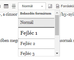
For optimization and a machine-readable structure, it is important not just to format headings differently on web pages, but to set them at the appropriate level from the drop-down menu.
How to write good headings?
The rule for a good SEO headline, and a user-friendly headline in general, is simple: summarize the content in a concise and clear way. A good headline tells us what we will read about underneath.
For example, if the text is about what content management systems exist, “How to build a website” will not be a good H1.
A general recommendation for the maximum length is around 70 characters, but this is not set in stone. A longer headline can be perfect, and sometimes a piece of content can be titled at this length only to the detriment of the descriptive function.
Headings in search engine optimization
By itself, it doesn't carry much weight when it comes to ranking, but that's true of almost all SEO factors. Good heading structure is one of many search engine optimization factors, and it's not just important for SEO, so it's definitely worth paying attention to.
As heading 1 describes the entire content of the page, it will be the most common one in terms of keywords (it will describe the general topic of the page). The subsections of the text break down the details of the topic, so H2s, H3s will contain the more specific, longer keywords.
How many heading 1's are good for SEO?
In theory, you can put more than one H1 on a page, especially since HTML5, as the HTML5 standard now defines multiple semantic page elements (e.g. section) within a page, which can have separate titles, even heading 1s.
If you are in doubt whether a section within the page that is different from or subdivides the main content is such an HTML section, it is also easiest to add a single H1 title to the page.
In general, you should be careful about adding more than one H1, as browsers do not necessarily support this HTML5 feature, so it is not necessarily good for accessibility either.
You can probably determine with absolute certainty which text element is the main title of our content — it is best to make it the H1.
Search bots will take into account or give the highest weight to the first one in the HTML if more than one H1 is added in the main content, but it may also be seen as a keyword manipulation intent to use more than one heading 1 in the main content.
Is it important that the headings follow each other in level order?
From an SEO and accessibility point of view, it is ideal if the headings follow each other in order:
- there is one Heading 1 (H1, the <h1> tag in HTML) at the top of the content. Heading 1 summarizes what the page as a whole is about,
- the content can be divided into subsections using Heading 2s (H2s, the <h2> tag in HTML),
- if we break down the text at Heading 2 level into further subsections, we use Heading 3s (H3s, the <h3> tag in HTML), etc.
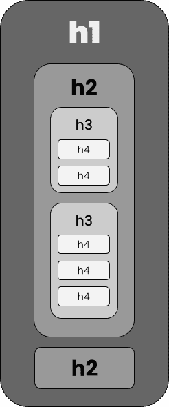
The ideal structure involves not skipping heading levels "downwards", i.e. after a H1, there should only be H2 (not a H3 or H4). “Upwards”, of course, the situation is different: for example, the end of a H5 subsection can also mean the end of a H4 and a H3, so a new H2 section can begin:
<H1> Interior Decoration
<H2> Bedroom
<H3> Cabinets
<H4> Display
<H4> Storage
<H3> Nightstands
<H3> Beds
<H4> Mattresses
<H5> Foam
<H5> Spring
<H4> Bedding
<H5> Pillows
<H5> Blankets
<H2> Bathroom
<H2> Kitchen
Do not use headings for formatting!
Headings are never used for formatting, i.e. we don't use H2 simply because we want to display text in a larger font size.
Instead, in this case, we can use inline CSS, i.e. switching to source code editing mode and add the required CSS formatting.
<p style="color:goldenrod;">Vitamin supplements are not a substitute for a healthy diet.</p>
Or, if you need to use this text formatting style regularly, we recommend adding it to the stylesheet (or having the web developer do so) so that you can select it from the Style drop-down list.
If you do not like the formatting styles of the heading levels, for example if you do not consider the difference between H2 and H3 to be sufficient, do not use H4 instead of H3 to increase the visual contrast.
Instead, if it is a one-off case, you can also use inline CSS, i.e. switch to source mode, and include the necessary formatting in the code.
<h3 style="font-size:24px;">Types of vitamin supplements</h3>
And if you want to change the style of the style of the headings globally, for the whole site, it's also best to modify the CSS file.
Checking the headings on a web page
The easiest way to check the heading structure of a web page is to use a browser extension such as SEO Meta in 1 Click.
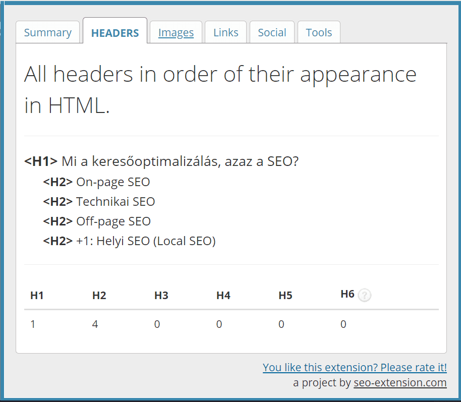
If you install this extension in your browser and visit a web page, you can easily review the document outline by clicking on the extension icon and then switching to the Headers tab. The levels of the headers are not only indicated by the <H1>,<H2> etc. tags, but their hierarchy is also indicated by indentation.
After the headings are listed, a table summarising the number of headings of each level on the page is also shown. For example, on our What is search engine optimization, or SEO? page, we have one Heading 1 and four Heading 2s:
Heading 1 and page title: can they be the same?
In the case of websites, we talk about heading 1 and page title, and the two concepts are not the same.
Headline 1 will certainly be seen by visitors to the website, as it is likely to be the first, or at least the most prominent, element of text on the page (and it will be tagged with the <h1> tag, so it will be read as such by screen readers).
The page title will be less prominent: visitors will most certainly only see it in the browser bar, and it will appear in Google's search results.

It's absolutely fine if the Heading 1 and the page title are the same. However, they are often slightly different.
If for no other reason, because the name of the website or business is usually included in the page title (e.g. Headings on websites and SEO | Prompt Web).
It's also relatively common for heading 1 to be longer (especially with the site name), so Google is likely to truncate in the results list. Therefore, when the H1 is a little long, you may want to add a shortened, condensed version as page title (e.g. H1: “Quality Content: What Is It, Why Is It Important and How to Create It?”, page title: “Quality Content | Prompt Web”).
You may also like: