What to Keep in Mind When Uploading Content
Ágnes Huszár
For best performance, content should be uploaded to the website with attention to detail. This not only benefits the site from an SEO perspective, but also contributes to its accessibility.
Optimizing activity during content uploading include performing technical SEO-related settings, as well as activities related to the formatting of text and images—these are summarised on this page.
When we have content that meets the quality criteria, we already turned the corner. We can crown our efforts by paying attention to the following during uploading:
Remove Formatting
Content copied from an external source, such as a word processor (eg. a Word file or a Google document) and pasted with Ctrl + V will bring the formatting styles of the original document, which causes a lot of clutter in the source code (lots of inline CSS, inserted formatting code).
Instead of pasting with Ctrl + Shift + V, it is better to press the Delete Formatting button in the HTML editor toolbar after pasting with Ctrl + V:

The latter solution is better because it preserves headings, links and paragraphs, only the text styles of the original document are "lost" and the text adopts the formatting style of the target context, i.e. the page style.
Conversely, in text pasted with Ctrl + Shift + V, everything becomes "normal" style, including headings, links become plain text, and paragraphs become line breaks.
Layout
Many content management system based websites have page builder functionality (such as our Flexi Build websites, or Elementor or WPBakery plugins for WordPress).
Content managers on such sites can build custom page layouts from various page elements (text boxes, slideshows, galleries, etc.) and colour them as they wish.
These websites allow for creativity, but it is worth making sure that the layout and text formatting supports the meaning of the text and makes it as easy to process content as possible.
Even if the site owner does not provide a specific idea for the layout of the content on the page to be uploaded, we will still upload the content so that the layout and formatting supports the meaning and makes the content easier to process for visitors.
For example:
- use the most suitable layout elements and layout for the meaning of the text and the purpose, the message the content conveys,
- the layout is clear and logical,
- the contrast between text and background color is high enough, content is easy to read,
- formatting and highlighting is consistent with the message,
- the fonts, font sizes, font colors and colors in general are in line with the brand and image,
- the layout looks good and easy to use on mobile devices as well.
Headings and Other HTML elements
The structure of a web page, the hierarchy of its elements and its meaning can be obvious by the formatting. For example:
- words in the largest font are most probably the Heading 1 of the page, a slightly smaller one is Heading 2, and so on,
- lines that begin with hyphens or dashes clearly appears to be a list,
- a set of data arranged horizontally and vertically in any way (e.g. with spaces) look like a table.
However, machines such as search bots and screen readers used by blind people cannot see such formatting. Because of this, it is important to mark up these text elements with the correct HTML tags.
By using the correct HTML elements, we help the machines to understand what the subject of our page is, which elements are the most relevant and important, and how each element relates to the others.
With an HTML editor that is used in content management systems, this is really easy: it works like a word processor.

Headings
By selecting heading 1, heading 2, etc. we can simply create the heading structure, which will result in a semantically correct HTML, i.e. it will be tagged with <h1>, <h2>, etc.
For SEO and accessibility, it is best if the headings follow each other in order:
- there is only one Heading 1 (the <h1> element in HTML) — it is typically at the very top of the content, and it summarizes what the page as a whole is about,
- the content can be divided into subsections using Heading 2s (the <h2> element in HTML),
- if we break down a Heading 2 level section into further subsections, we use Heading 3s (<h3> in HTML), etc.
Learn more about heading optimization
Other HTML Elements
For the ease of machine readability, other features of user-friendly HTML editors should also be used as intended.
For example:
- Insert an HTML table by pressing the Table button. When setting up a table, you can add any number of rows and columns, as well as a regularly formatted header with the simplicity of checking a checkbox.
- With the Bulleted List and Numbered List buttons, we can create properly formatted lists that are tagged with <ul>, <ol>, <li> in the HTML.
- Use the superscript and subscript buttons (m3, CO2, etc.).
- Add a divider line to the page using the "Insert Horizontal Line" toolbar button.
Editing and Optimizing Images
To get the most out of your photos, optimize them before you insert them into the page or upload them into the media library:
1. Crop the images if necessary or reasonable (for example, if there is a large blank space around the subject).
The cropping ratio should be chosen by looking at the aspect ratio at which the image will be displayed on the website.
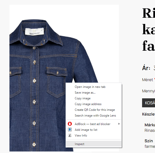
For example, if you are preparing product images for an ecommerce website, open a product page, right-click on the product image and select Inspect from the local menu:

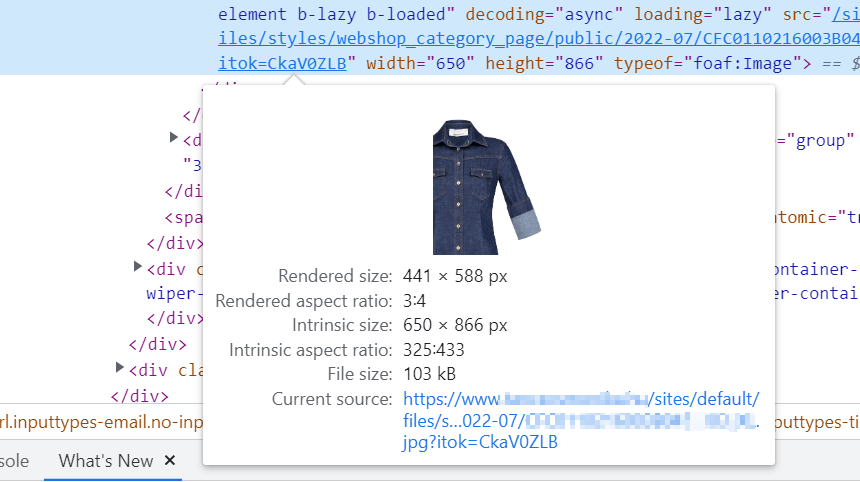
Then, in the window that opens, hover the cursor over the image path and in the popup you will see the Rendered aspect ratio:

2. Resize. Check the size of the rendered image in pixels (Rendered size) as described above. You should only upload the image at a larger size if you want the visitor to be able to view it at an even larger size, for example, by right-clicking on it.
3. Compress. Tinypng/Tinyjpg is an excellent tool for this purpose.
4. Name the image files appropriately (e.g. sunset.png instead of img0274636.png), and, just like with other documents, we use only lowercase letters, numbers, and hyphens in the file names of images.
After uploading, add at least an empty alt attribute (just two double quotes, "" — on our sites, this is automatically added to all images, even if the alternative description field is not filled out) to each image, and where necessary, write an alternative description.
The alternative description is important because if an image cannot be displayed for some reason, the alternative text is displayed instead, and screen readers read the alternative text where there is an image in the content. The alt attribute does not always need to be filled in (for example, images with a decorative function do not need to have alternative text), but all images must have an alt attribute.
Alternative texts can be checked with browser extensions like SEO Meta in 1 Click or by right-clicking on the page, selecting "View page source" from the pop-up menu, and then searching in the code for alt=.
See our Content Management Pricing