A weboldalak felépítése: fix és variálható oldalelrendezések
Fixed and Variable Page Layouts
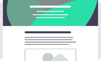
For many content types and websites, a fixed page layout is the most reasonable solution, but in other cases it can be useful if the page layout can be varied.
Fixed Layouts
For many people and businesses, the ease and speed of content uploading is a priority, so content arranged in a simple layout will do the job perfectly.
When you want a simple and cost-effective company profile website that is easy to edit, a website with a fixed page layout and a contact form functionality can satisfy your needs.
We offer such websites with our Easy Build package.
Variable Page Layouts
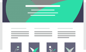
If you want to be able to build more complex page layouts (for example, to arrange the content into multiple columns on a page, or place images and text next to each other in a mobile-friendly way, or add a slideshow, etc., then a website with page builder functionality is the way to go.
We offer such websites with the Flexi Build website package.
These websites are not based on a fixed page template (page layout), but on layout elements that can be combined and arranged in different ways within the pages.
Layout elements are small graphical units that are used to display content, and their formatting is predefined based on the graphic design.
Layout items are, for example, the following:
- the WYSIWYG / HTML content editor (also found in the fixed page layout),
- the multi-column layout,
- the slideshow,
- the image-text box,
- the hover box, i.e. an image box that changes its content on hover (e.g. the text can be revealed by moving the cursor over it).
Thanks to the predefined style of each page element, you can be sure that any page with a unique layout will look good on smaller screens, without you having to check and make any adjustments during content upload.
Layout elements that have been used once can be reused on other pages. And if the content of a layout element is changed, it will be updated everywhere it has been used.
This section consists of two text layout elements, arranged in two columns. On a larger screen, the two text elements are side by side, and on a small screen (mobile) they are placed below each other.
Some examples for layout elements from Prompt.hu:
- icon box,
- icon box with link,
- media,
- image and text box,
- comparison slider,
- timeline, etc.
These are placed in the following layouts:
- full width content,
- 2 columns (½-½ width)
- 2 columns (⅔-⅓ or ⅓-⅔ width)
- 3 columns (⅓-⅓-⅓ width)
- slideshow (carousel).
For example, this is a two-column layout with 50-50% width columns, with a text layout element in one column, and a media layout element in the other.
On a larger screen, these two page elements are side by side, and on a small screen (mobile), they are below each other.
This is also a two-column layout, but instead of a 50-50% column width ratio, the column width ratio is 1/3 : 2/3.
This column has a text layout element in one column and a video layout element in the other. The video is placed below the text on mobile.
This is a three-column layout, where there are text layout elements in the first and third columns, and a media layout element in the middle one.
On a larger screen, the three layout elements are next to each other, while on a small screen (mobile), they are below each other.
Business Website Development Options and Prices
Choose from our fixed-price website development packages, or request a quote for custom website development if you need a unique design and/or functionality for your business website, or if you want to connect your website to an external system!
Easy Build
- fixed page layout
- customizable graphic design
- can be delivered in 2 days
- web hosting for 1 year included
599 EUR + VAT
Flexi Build
- custom page layouts
- page layout building blocks
- customizable graphic design
- web hosting for 1 year included
1,299 EUR + VAT
Custom Developed Website
- custom graphic design
- custom functionality
- ...or both!


